6 visual trends to help your business stand out
A picture is worth a thousand words. It is said that our brain can process images 60,000 times faster than words.
There are many ways to tell a story and anyone in marketing you meet right now will tell you in order to connect with your customer you can’t keep pushing product or service, you need to tell a story. This is absolutely true! My friends at Adobe hosted an excellent report and webinar, called Refining Visual Storytelling hosted through AdWeek.com. Thier report explains which images you should use and how to tell your brand’s story through these trends. Here’s my quick synopsis.
6 trends that are crucial to understanding how to better your marketing efforts and stay on top of the trends to better connect with your customers.
Do you know what images should you be using to tell your brand story?
Do your brand images resonate with your viewers? It’s vital to take these trends into consideration whether you’re a small or large business!
Here are the 6 visual trends according to Adobe!
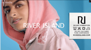
1. The fluid self. Your viewers and consumers are expected to see themselves represented in your images. Self-defined Identities. The identities of diversity need to be integrated into your brand that and should speak to inclusion. Content should represent all lives and all identities, no one is forgotten. The areas where identities are being shown most are in the fashion industry. An example that, Adobe touches on is the brand, River Island, Thier ads touch on gender equality, shape equality and cultural equality.
The images aren’t the only thing that is rooted in a strong identity being represented. Thier messaging is as well. They are doing it with playfulness and joyfulness. Take a look below!
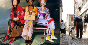
2. Multilocalism. This means that every image must convey local experience across different cultures and countries. We live in a world of travel and accessibility. This trend is reflected and is supported by the style and identities. There is a beautiful thing right now, that people see themselves as locals but also interconnected with the global world. Here is an example, Adobe shows. Take a look below at Gucci ad’s, the three women sitting together sharing a bench but all come from different parts of the world.
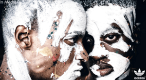
3. Touch and Tactility. They are presenting a visceral experience brought on by our growing desire for connection. Your images must have a physical touch feel. They want to see the pores in the skin to the point it looks as real as 3d. They must show the connection between people as well as bring texture to the image. Adidas is showing a great example. Look at the texture and the intense pose. And the human touch with the hands touching their face. Sensory Overload!
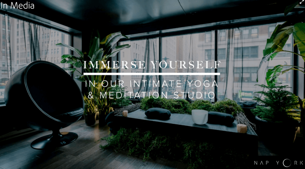
4. Silence and Solitude. A type of image that presents an overall impression of serenity of peace. With today’s technology and information overload, we are being drawn to a sense of escape to find a minute to ourselves. Words that your images can convey, would be rest, solitude and the experience of calm.
“We charge the people that power the world”, is the message of an NYC business called NapYork is using this trend as a business model. See advertisement below. Sleep is being fantasized. Now that these things are so rare and what’s rare becomes a luxury becomes something you want to be apart of your life.
5. Creative Reality. The Images relate this trend to reveal a creative fantasy and idealized world. This is rooted in the escape or political unrest our world is under. The trends feel vibrant and whimsical. They give you a sense of wonder. Some words to describe it are psychedelic, whimsical and daydreaming. Adobe describes it as “At the intersection of reality and creativity comes to a new wave of visual art—full of hyper-sensorial experiences and jaw-dropping intensity.” See below for the example.

6. History and Memory. Visuals that reference the past. In these images, there is an awareness and appreciation of the art of the past and art history but executed with computers. They tap into people’s nostalgia. Timeless is one of my favorite shows and they keep going back to past. It brings us back to the biggest times in American history. but the stars of the show are at odds with technology, time travel. The example below is drawing up ancient history from Rome and into the fashion shoot. Some terms to words to describe those image are past history and remembrance.
Adobe did an excellent job of creating these trends! Many of these examples used fashion, but it can be applied to both service and product based companies. Here is the link to see the slide deck and more images. To get some ideas on how your brand can leverage these trends! Set up a time to chat with me.

